
Calligraphy tattoo styles and how to choose lettering that lasts
What calligraphy tattoo styles actually mean
Calligraphy tattoo styles are tattoos where lettering carries the design, rather than sitting beside an image as a caption. The style might be fine line cursive, bold blackletter, brush script, Arabic-inspired lettering, Chinese or Japanese characters, a handwritten name, or a short phrase shaped around the body. The best option is not simply the most attractive font. Strong lettering tattoos balance meaning, legibility, line weight, spacing, placement, and how the design is likely to read after it heals and ages.
Because tattoo ink sits in living skin, very small letters, crowded flourishes, and ultra-thin strokes can lose clarity faster than lettering with enough space around it. For readers comparing broader tattoo styles, calligraphy is one of the most personal categories because the text itself carries the main message.
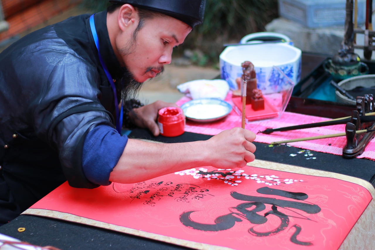
In calligraphy, the written mark is treated as visual art. In tattooing, the artist has to translate a paper or digital lettering concept into a stencil that works on curved, moving skin. The finished piece can be minimal, elegant, dense, or dramatic, but it still needs to be readable at the chosen size and placement.
Popular calligraphy tattoo styles
Most people searching for calligraphy tattoo styles are looking for a practical design direction, not a strict historical category. The styles below often overlap in finished tattoos, but each has different strengths and limits.
Fine line cursive
Fine line cursive is often used for names, dates, short vows, single words, and memorial phrases. It feels intimate because it resembles handwriting. The main design risk is scale. If the letters are too small or the loops are too tight, the word can become difficult to read as the tattoo settles. This style works best with moderate spacing, a clear baseline, and limited decorative swashes.
Blackletter and gothic script
Blackletter, often called gothic script in tattoo discussions, uses dense vertical strokes, sharp angles, and a strong medieval manuscript influence. It has visual weight and is common for chest pieces, stomach lettering, back lettering, and large forearm designs. It is not a good match for tiny tattoos. The letterforms need room so counters, stems, and shaded areas do not merge into a dark block.
Brush script
Brush script tattoos imitate the movement of a brush, with heavier downstrokes and lighter connecting strokes. The result can feel energetic, artistic, and less formal than classical cursive. This style works well for words that benefit from movement, such as a short mantra or a phrase following the shoulder, ribs, collarbone, or forearm.
East Asian character tattoos
Chinese hanzi, Japanese kanji, kana, and Korean hangul can create powerful calligraphy tattoos, but they require careful verification. Character choice, stroke order, context, and cultural meaning all matter. A direct dictionary translation may not produce the intended phrase. For a public-facing or permanent tattoo, the safest approach is to consult a fluent reader and, when possible, a calligrapher familiar with the script before the stencil is finalized.
Arabic and Islamic-influenced calligraphy
Arabic calligraphy has a long artistic history and can be fluid, geometric, or highly ornamental. However, tattoos using Arabic, Qur’anic phrases, or religiously significant text can raise cultural and religious concerns. Anyone considering this direction should verify the wording, letter connections, direction, and context with a qualified reader. The goal is not only to avoid spelling mistakes, but also to avoid using sacred or culturally loaded text casually.
Minimalist typewriter and serif lettering
Not all lettering tattoos are traditional calligraphy. Typewriter-style, serif, and small uppercase tattoos are closer to typography, but many people consider them during the same design search. These styles can be clearer than ornate scripts, especially for longer quotes. The trade-off is that they may feel less personal unless spacing, placement, and line breaks are carefully composed.
How to choose a style that fits the message
The lettering style should match the emotional tone of the words. A delicate cursive name can feel private and sentimental. A blackletter surname can feel bold, heritage-driven, or confrontational. A brush-style word can feel active and expressive. Before choosing a design, narrow the idea to three decisions: what the text says, how public it should feel, and how readable it must be to other people.
Short text usually gives the best result. One word, a date, initials, coordinates, or a brief phrase gives the artist more room to refine spacing and shape. Long quotations are possible, but they often require larger placements and simpler lettering. If the message depends on every word being legible, avoid overly ornate scripts.
- For a private reminder, consider fine cursive, small serif lettering, or handwriting-inspired script.
- For a visible statement, consider blackletter, bold brush lettering, or high-contrast script.
- For a memorial tattoo, prioritize clarity, spacing, and a placement that will not distort heavily with movement.
- For translated text, verify meaning with more than one reliable language source before tattooing.
Style comparison by readability, placement, and aging
The table below is an editorial planning guide, not a rulebook. Skin type, artist technique, ink, aftercare, and placement all influence the final result. Still, these comparisons help explain why the same phrase can work well in one lettering style and fail in another.
| Style | Best for | Readability | Placement notes | Main caution |
|---|---|---|---|---|
| Fine line cursive | Names, dates, short words | Good at moderate size | Wrist, collarbone, ribs, inner arm | Avoid tiny loops and crowded flourishes |
| Blackletter | Surnames, strong statements, large words | Strong when large | Chest, back, forearm, stomach | Can become too dense if scaled down |
| Brush script | Expressive words and short phrases | Medium to high | Shoulder, forearm, ribs, thigh | Needs controlled contrast between thick and thin strokes |
| East Asian characters | Single concepts, names, poetic ideas | High if written correctly | Spine, forearm, shoulder, ankle | Translation and character accuracy are essential |
| Arabic-style lettering | Names, selected words, ornamental flow | Depends on complexity | Forearm, chest, shoulder, ribs | Letter connection, direction, and cultural context matter |
| Typewriter or serif | Quotes, literary lines, dates | High | Forearm, ribs, back, upper arm | Long text needs enough size and line spacing |
Placement changes the look of lettering
Calligraphy tattoos depend on clean alignment. A word that looks balanced on paper can curve, compress, or stretch when it is placed on the body. The forearm is popular because it offers a relatively readable surface. The collarbone can make a phrase feel elegant, but the letters need to follow the natural line without drifting. Ribs create a dramatic effect, though the area can be more sensitive and the skin moves with breathing. The spine suits vertical characters or stacked words, but alignment needs particular care.
Hands, fingers, feet, and the side of the wrist are often requested for small lettering. They are also challenging because they experience frequent movement, friction, and exposure. If long-term clarity is the priority, ask the artist whether the chosen placement can hold the line weight and spacing required by the script.
A useful test is to print or view the stencil at actual size. Look at it close up, then from a normal conversation distance. If the word is hard to read before it is tattooed, it is unlikely to become clearer after healing. See also: tattoo care.
Design details that make calligraphy tattoos age better
Lettering ages best when the design gives the ink enough room to sit in the skin. This does not mean every tattoo must be large or bold. It means the artist should avoid placing delicate internal spaces too close together. The smaller the tattoo, the simpler the letterforms should be.
- Choose adequate spacing between letters, especially in cursive joins.
- Avoid excessive flourishes that cross over important letter shapes.
- Use thicker strokes for blackletter and brush styles when the tattoo is large.
- Keep very small tattoos to fewer characters or a cleaner type style.
- Review the stencil on the body, not only on a screen.
- Ask how the design may look after healing, not only on the day it is finished.
Color also matters. Black ink is the standard choice for calligraphy because it provides contrast and keeps the focus on form. Red, white, and pale colors may be chosen for specific effects, but their appearance can depend more heavily on skin tone, placement, and healing. If readability is the priority, high contrast is usually safer than subtle color.
Accuracy, safety, and cultural context
Lettering mistakes are hard to hide. Before the appointment, confirm spelling, capitalization, punctuation, dates, names, and translations. Roman numerals deserve special attention because a single character can change the date. For another language, do not rely only on automated translation. Ask a fluent reader whether the phrase sounds natural, whether the grammar is correct, and whether the words carry unintended meanings.
Safety is also part of style choice. The U.S. Food and Drug Administration explains in consumer materials that tattoos are made by inserting ink into the skin and that infections, allergic reactions, scarring, and reactions that appear later can occur. The American Academy of Dermatology notes that some tattoo reactions happen immediately, while others may appear weeks or years later. These points are not reasons to avoid tattoos altogether, but they are reasons to choose a licensed professional, follow aftercare instructions, and seek medical advice if redness spreads, pain worsens, pus appears, fever develops, or a rash persists.
Aftercare affects the final look of lettering. A script tattoo with thin strokes can suffer if scabs are picked, if the area is soaked too early, or if friction repeatedly irritates the healing skin. Follow the artist’s instructions, keep the area clean, and protect healed tattoos from heavy sun exposure. For medical imaging, FDA and dermatology sources advise telling health professionals about tattoos before an MRI because rare swelling, burning, or burns have been reported.
A practical checklist before booking
Use this checklist to turn inspiration into a tattooable concept:
- Write the exact text and confirm spelling, date format, and punctuation.
- Decide whether the tattoo should be readable to everyone or meaningful mainly to you.
- Choose a lettering family, such as cursive, blackletter, brush, character-based, or serif.
- Test the design at actual size before approving the stencil.
- Check the placement while standing, sitting, and moving naturally.
- For translated or sacred text, verify language and context with a qualified source.
- Ask the tattoo artist whether the line weight and spacing are realistic for long-term clarity.
The strongest calligraphy tattoos usually look simple at first glance and thoughtful on closer inspection. They do not rely on decoration alone. They work because the words, script, placement, and scale support the same idea.
Frequently asked questions
What is the most readable calligraphy tattoo style?
Simple cursive, serif lettering, and clean brush script are often more readable than highly ornate styles. Readability depends on size, spacing, line weight, and placement, so a clear stencil at actual size matters more than the style name.
Are calligraphy tattoos good for small designs?
Yes, but small calligraphy tattoos need restraint. Short words, initials, and dates work better than long phrases. Avoid tight loops, heavy flourishes, and letters that touch too closely.
Which placement is best for script tattoos?
The forearm, upper arm, collarbone, ribs, back, and thigh can all work well. The best placement is the one that gives the text enough room and does not distort the letters too much when the body moves.
Should I use a font or custom lettering?
A font can be a helpful starting point, but custom lettering usually fits the body better. A tattoo artist can adjust spacing, stroke weight, and curves so the design works as a tattoo rather than as flat digital text.
How do I avoid a translation mistake?
Use more than one verification step. Ask a fluent reader, confirm the cultural context, and review the final stencil character by character. For names, religious phrases, or idioms, expert review is especially important.