Which Tattoo Shading Styles Look Best for Your Next Tattoo?
Which Tattoo Shading Styles Fit Your Design Best?
Choosing between tattoo shading styles can change the feel of a tattoo, even if the outline stays the same. A rose can look soft with smooth gray wash, stronger with traditional color packing, or dry and grainy with pepper shading. If you are still sorting through broader tattoo styles, start there and treat shading as the part that sets weight, depth, and texture.
A Pew Research Center survey published in August 2023 found that 32% of U.S. adults have a tattoo, including 22% who have more than one. That number matters in daily studio work. Tattoo shading is not a small side detail anymore; more clients compare healed photos, ask about process, and book with clearer expectations. (pewresearch.org)

Shading as Value Control
Shading is how the artist manages light and dark in the skin. Dark areas pull attention, while softer areas give the design space. A well shaded tattoo usually needs a readable outline, clear mid tones, and enough open skin or pale tone so the piece does not look flat.
Style Choice Starts With the Subject
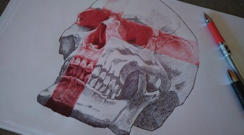
The subject should lead the shading choice. Portraits need smooth value changes because a hard jump can make a face look wrong. Skulls and daggers often handle heavy black and gray well, while botanical tattoos can use soft gradients, pepper shading, or color blends. Tiny symbols usually need less shading, since too much texture can turn muddy after healing.
Good Shading Needs Healthy Skin
Shading means repeated passes through the same area, so skin condition affects the result. Dry, sunburned, irritated, or freshly tanned skin can make blends less even. For a cleaner finish, drink water, stay out of hard sun before the session, and listen if your artist wants to split a large shaded piece into two sittings. That extra time can protect both the skin and the final contrast.
How Do the Main Tattoo Shading Styles Compare?
Clients often hear several terms during a consultation and feel mixed up. Black and gray, whip shading, stipple, pepper, dotwork, color blend, realism: they are connected, but they do not leave the same finish. Think of them like different finishes on the same base drawing, except the finish stays in the skin for years.
Smooth Black and Gray
Smooth black and gray uses diluted black ink to build soft shadow. It is common in portraits, religious pieces, animals, statues, roses, clocks, and sleeve backgrounds. The style can look quiet or strong depending on contrast and skin tone. If you want a classic healed look without relying on bright pigments, this is often the first option to discuss.
Whip Shading and Brushy Movement
Whip shading comes from a flicking needle movement. The mark is usually darker where the needle starts and lighter as it moves away. You see it in traditional tattoos, illustrative work, sketchy designs, and bold flowers. It gives movement and a bit of rough texture, so on the right design it looks intentional rather than unfinished.
Stipple, Pepper, and Dotwork Texture
Stipple shading builds tone with dots. Pepper shading is close to it, but it often looks more scattered, almost like a light spray. Dotwork can be tighter and more planned, especially in geometric pieces. These methods suit mandalas, sacred geometry, moths, ornamental tattoos, fine line florals, and soft shadows under small objects. They can heal lighter than smooth gray wash, so spacing and contrast need to be planned from the start.
When Should You Pick Color Shading Instead of Black and Gray?
Color shading is not only for bright tattoos. It can be soft, old-school, dark, clean, or painterly, depending on the palette and the artist’s hand. The question is simple: does the color make the design easier to read? If it only makes the tattoo busier, black and gray may age in a cleaner way.
Color Gradients for Florals and Neo Traditional Work
Color gradients are useful in peonies, chrysanthemums, snakes, birds, fruit, flames, and neo traditional portraits. A warm orange fading into red can give a flower more body. A blue shadow under green leaves can cool down the whole piece. The main point is contrast. The colors need a real value gap, not just different names on an ink bottle.
Muted Tones for Softer Healing
Muted color shading gives a softer, already-worn look. Common choices include dusty rose, olive green, ochre, clay red, and smoky blue. These tones fit vintage flash, botanical tattoos, and calm decorative pieces. They may not read across a room like bright color, but they can sit more naturally on many skin tones.
Skin Tone and Contrast Checks
Your artist should check how color sits against your skin tone. Pale yellow on light skin, deep purple on dark skin, and soft gray on medium olive skin can all fade into the background if the value is too close. A short talk over the stencil, healed photos, and small color tests can help avoid a poor match. It is fine to ask about this before the machine starts. In a working studio, that is normal conversation.
Which Shading Style Ages Best on Skin?
No reliable public dataset ranks tattoo shading styles for long term aging across all studios, machines, needle groups, skin types, and aftercare habits. Public surveys can show how many people have tattoos, but they do not prove that one shading method always heals and ages best. A more useful check is whether the design has enough contrast and enough open space.
Clear Values Over Tiny Detail
Clear values usually age better than tiny detail pressed into a small area. If a shaded eye, pet portrait, or statue face is too small, the soft gray shapes can join together over time. Bigger designs give shadows more room to settle. For example, a palm sized lion face gives the artist much less working space than a half forearm lion. This is especially true around the eyes, nose, and mane.
Placement, Sun, and Daily Friction
Placement changes the way shading holds. Outer forearms and calves often keep shaded work well when the tattoo is cared for. Fingers, palms, feet, elbows, and areas with constant rubbing are harder to keep clean over time. Sun exposure also cuts contrast. A black and gray sleeve can still lose its soft look if you spend summer outside without sunscreen after it heals.
Touch Ups as Normal Maintenance
A touch up does not mean the first tattoo was done badly. Some skin heals lighter, and some color settles unevenly. Large shaded pieces may need a second pass after the first layer has settled. This is common with backgrounds and darker value areas. If your artist asks to check the tattoo after six to twelve weeks, it is worth doing. See also: tattoo care.
How Can You Talk With Your Artist About Shading?
A clear consultation saves time, money, and some stress. Do not only say make it realistic or make it soft, because those words can mean different things from one artist to another. Bring a few examples, point to the exact parts you like, and ask how that look will work on your body area.
Bring References With Notes
Bring two or three references, not thirty. Too many pictures can pull the design in different directions. Mark the parts you like, such as soft cheek shadows, a heavy black background, dotted texture around leaves, or a smooth fade near the wrist. It also helps to bring one example of what you do not like. That often gives the artist a faster read on your taste.
Ask About Ink, Hygiene, and Healing
Safety should be part of any shading talk, especially when the tattoo has large filled areas. The U.S. FDA issued final tattoo ink guidance in 2024 and noted that firms conducted 18 voluntary recalls of tattoo inks contaminated with microorganisms from 2003 through 2024. For clients, the takeaway is simple: choose a clean studio, ask about sealed supplies, and follow aftercare. Those steps are basic, but they matter. (fda.gov)
Read the Portfolio Like a Client
Look for healed photos, not only fresh photos. Fresh shading can look glossy and dark, then settle softer after healing. A useful portfolio shows steady healed contrast, clean gradients, and skin that does not look overworked. If an artist rarely shows your preferred shading style, ask about it before booking. It is better to ask early than to guess from unrelated work.
What Should You Expect During Healing?
Shading can change a lot in the first few weeks. Fresh work may look darker, redder, shinier, or stronger than expected. Peeling then starts, and the tattoo can look cloudy for a short time. This stage worries many first timers, but it is usually part of normal healing.
Fresh Shading Looks Darker at First
Right after the session, black and gray shading can look too dark. Color shading may look brighter than the healed result. Part of that comes from ink in irritated skin, plus redness and swelling. Give the tattoo time before judging the final tone. The healed tattoo is the one that matters.
Peeling Can Break the Illusion for a Week
During peeling, smooth shading can look uneven. Dotwork can look less sharp, and color can seem dull under thin flakes. Do not pick at the skin. Picking can pull pigment and leave small pale spots. It is plain advice, but steady aftercare is what gives the cleanest healed result.
Aftercare Keeps the Finish Cleaner
The American Academy of Dermatology notes that redness and swelling can be normal after tattooing. It also says rash, unusual pain, oozing, or worsening symptoms can point to a problem. If something feels wrong, contact a medical professional and your tattoo artist instead of waiting it out. Fast action is better than guessing at home. (aad.org)
FAQ
Q1: What Is the Most Popular Tattoo Shading Style? A: There is no reliable public ranking for shading style popularity across studios. Black and gray is widely used because it works for portraits, realism, florals, and classic sleeve work.
Q2: Is Stipple Shading Better Than Smooth Shading? A: Stipple shading is better when you want dotted texture, ornamental work, or less visual weight. Smooth shading is better for portraits, soft shadows, and realistic depth. The better choice depends on the design.
Q3: Do Tattoo Shading Styles Hurt More Than Linework? A: Many people say shading feels easier because the motion can feel softer. Large shaded areas can still get sore after repeated passes. Placement, session length, and personal pain tolerance matter a lot.
Q4: Can Color Shading Work on Darker Skin? A: Yes, but contrast matters. Strong value differences, smart color choices, and healed examples on similar skin tones help you judge the likely result before the session.
Q5: How Long Should You Wait Before Judging Healed Shading? A: Wait at least four to six weeks for the surface to settle. Large pieces or heavy shading may keep softening for longer, and your artist may suggest a touch up after full healing.